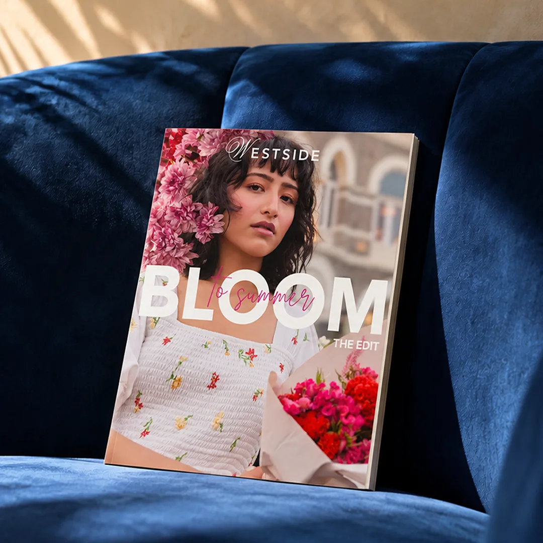
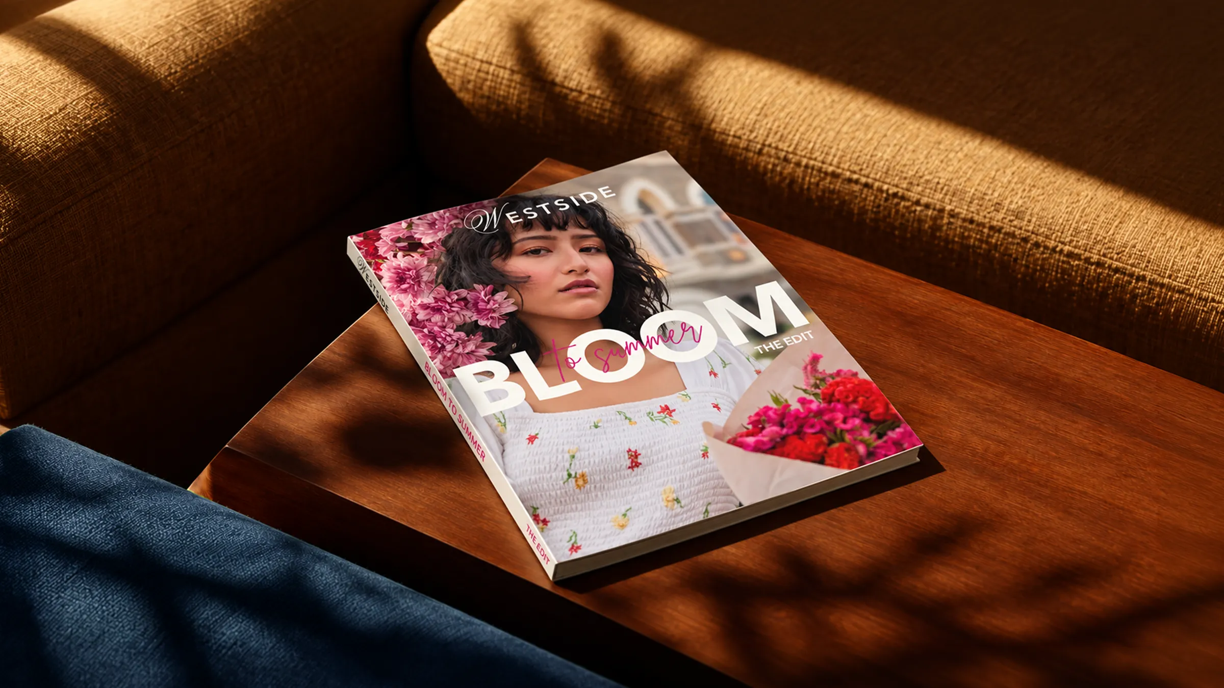
Westside Bloom
- OUR SCOPE
- Summer Lookbook
- INDUSTRY
- Apparel
Florals for summer?
Original: No. Iconic: Yes
Twenty-five years of getting fashion right, with looks for every season, and customers who already trust them. What was missing was a design language that popped with colour, creativity, and fun, vibe-driven personality to match the confidence they’d already earned.
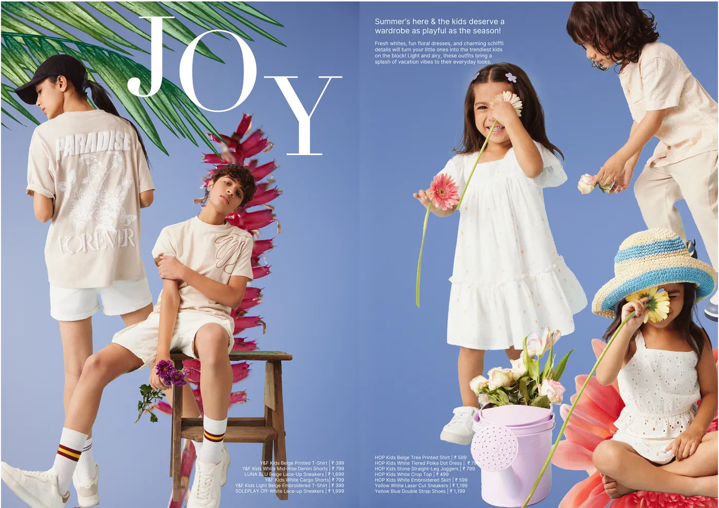
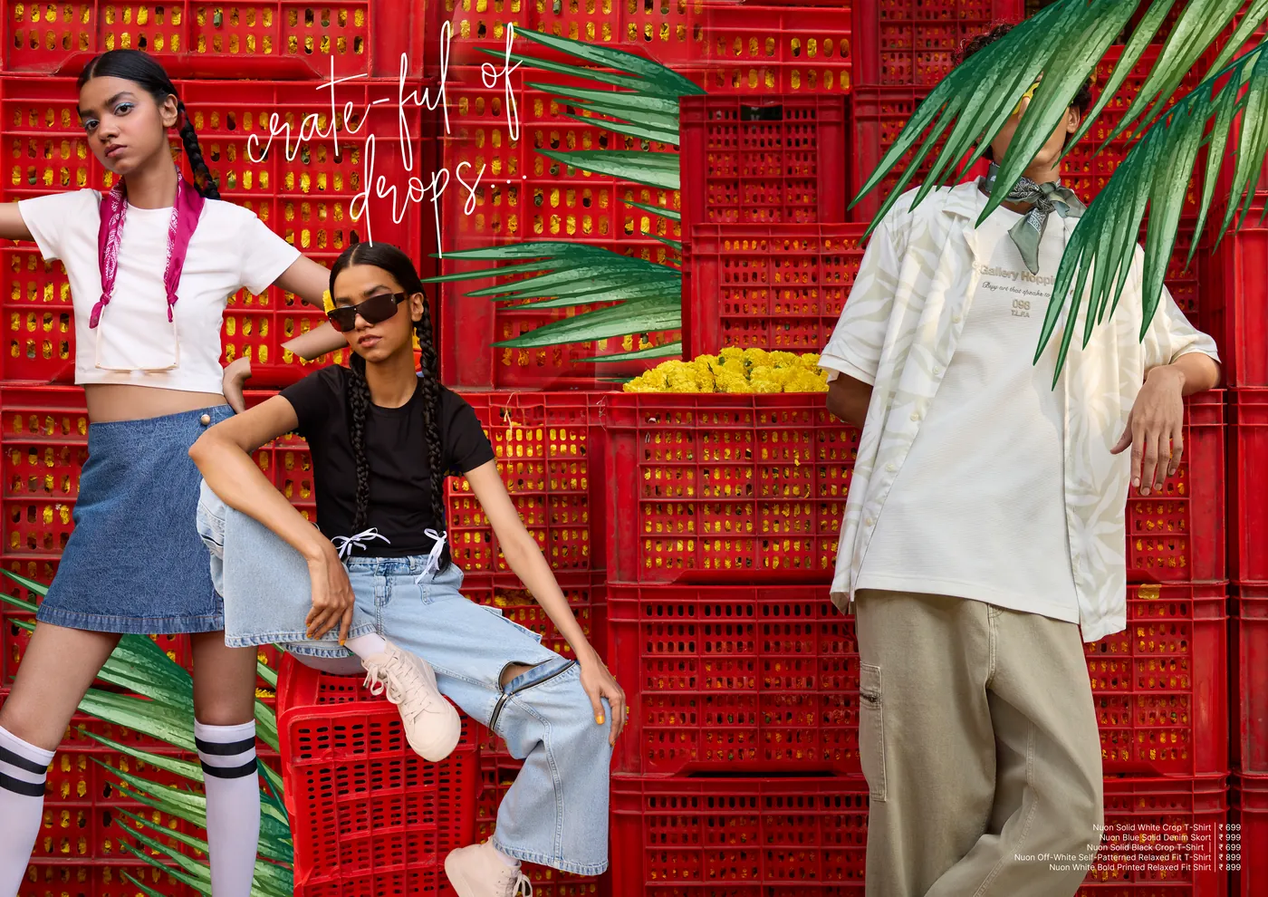
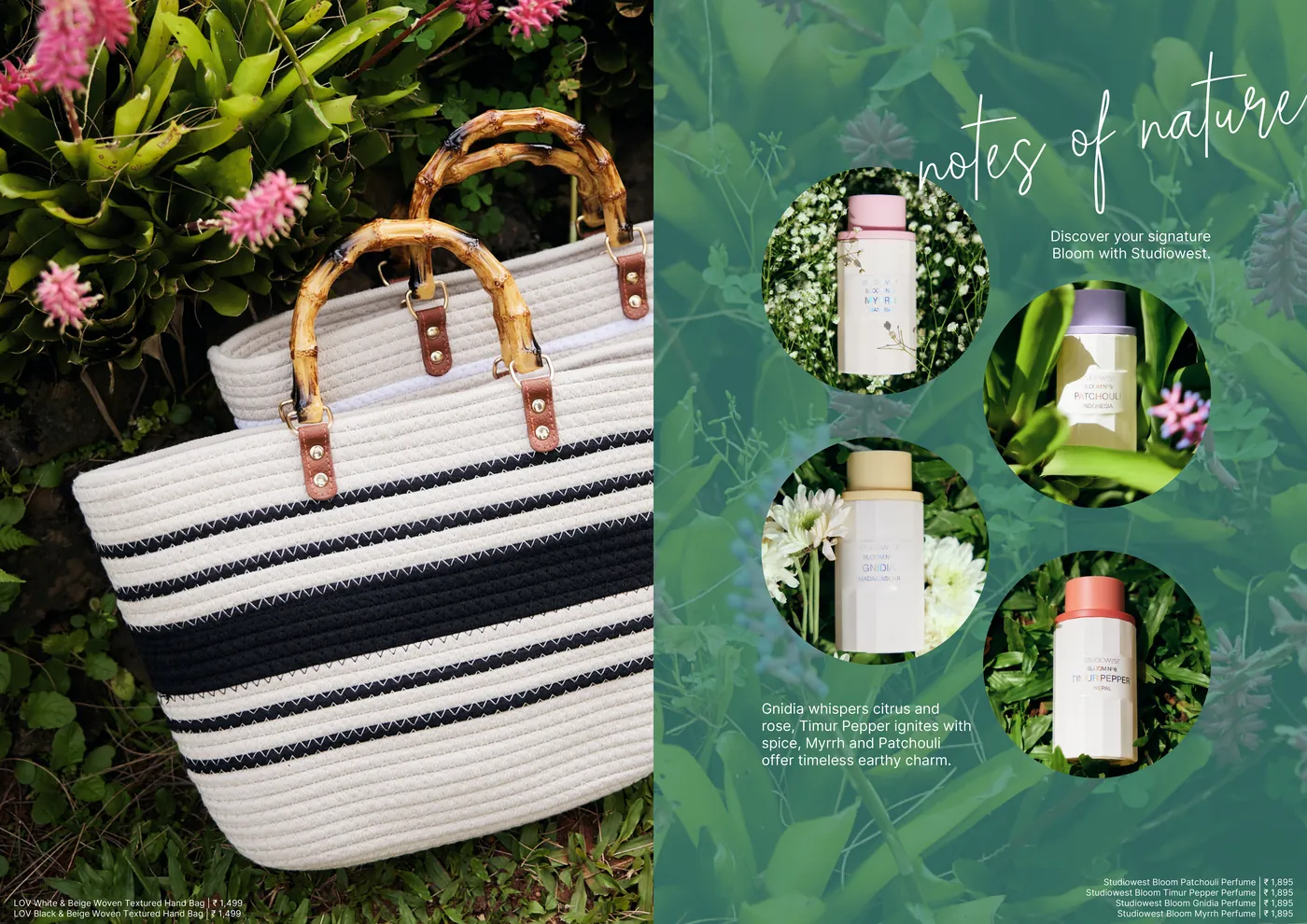
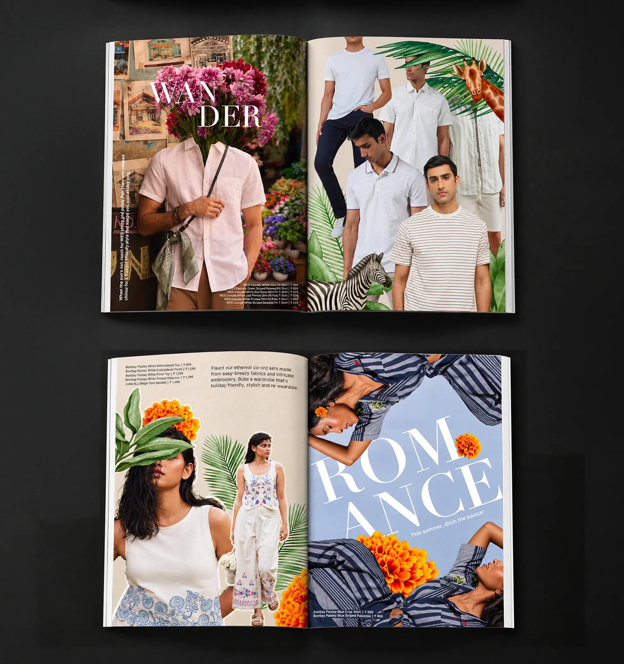
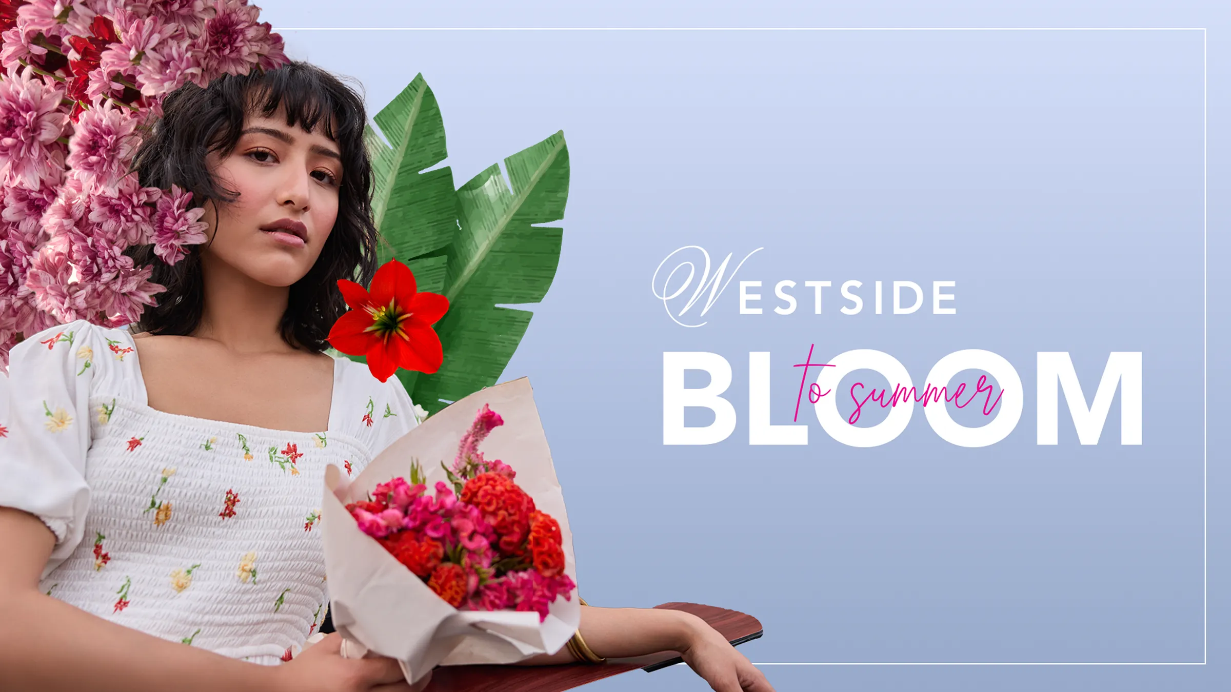
So for their 25th summer edit, we leaned into a hyper-realistic, bold, never-superficial, identity- confident enough to comment on the trend instead of just chasing it. We designed with the shopper in mind first, not a customer scanning a catalogue, but someone flipping through a magazine, wanting a reason to stay on the page.
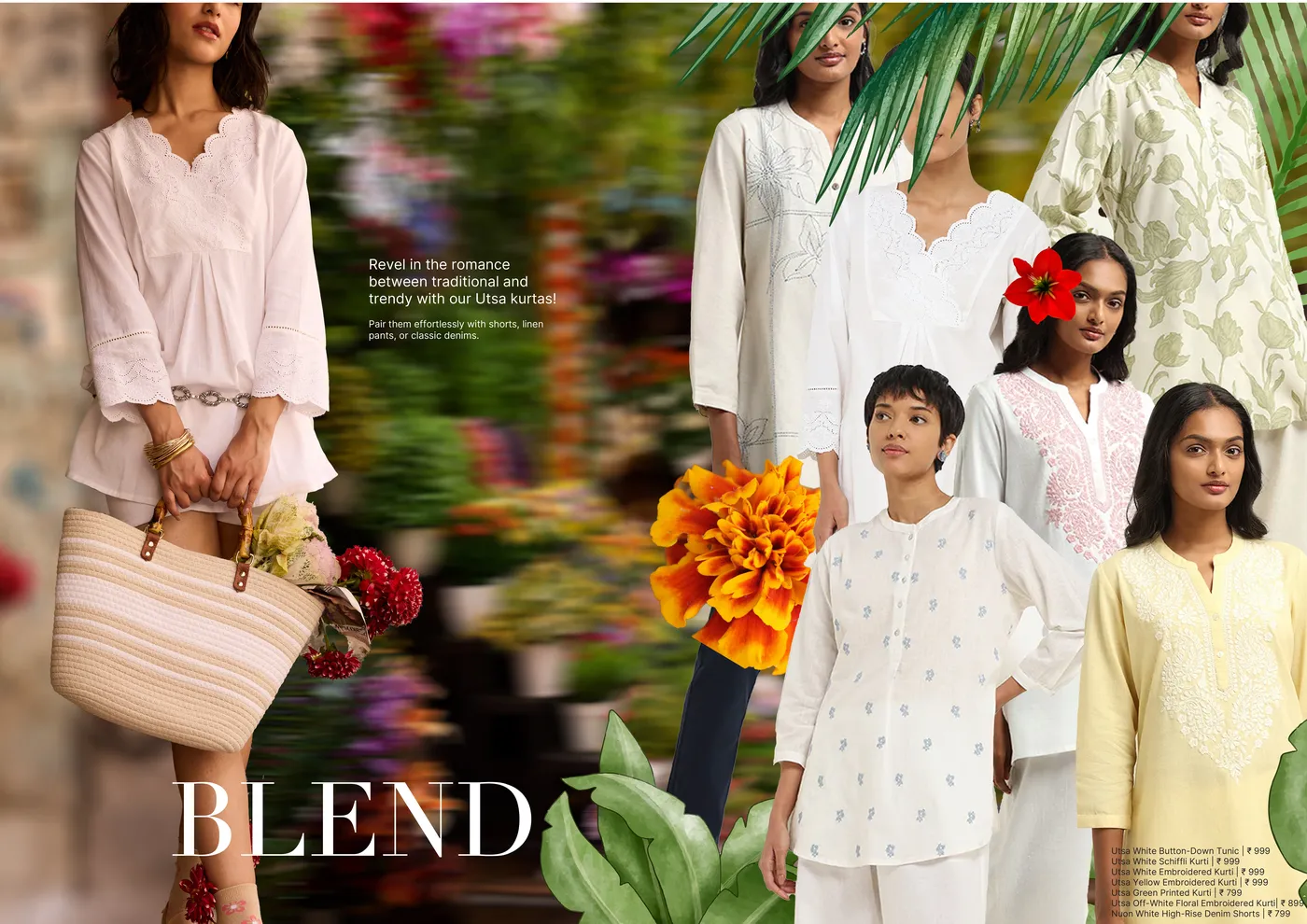
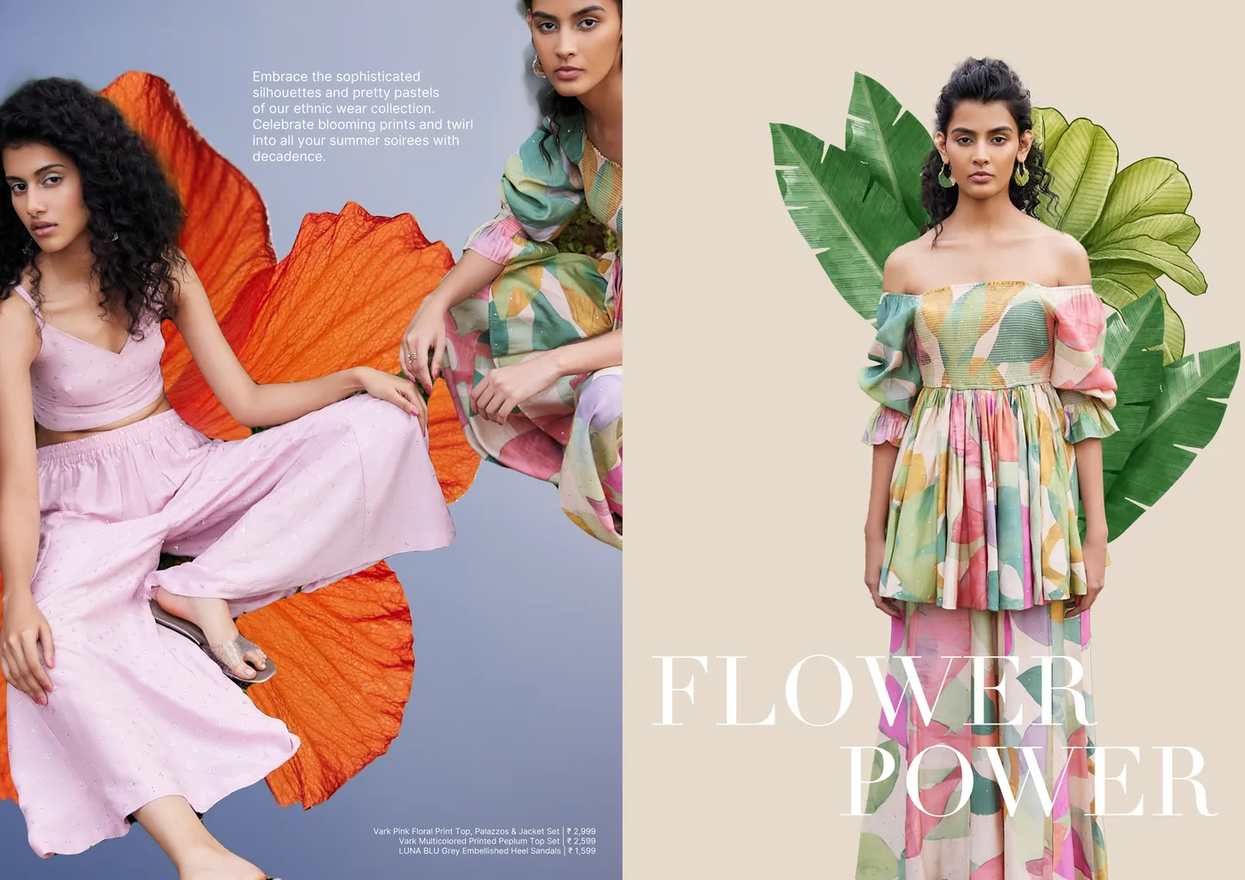
An Editor’s Note that actually had something to say. Mood-led sections- Flower Power, Pure, Joy, Wander, Escape, Blend- that gave every piece of clothing a story instead of a serial number. Real environments layered with surreal botanical interventions and oversized editorial typography turned product pages into something worth lingering on. And a tone that stayed homegrown, aspirational but achievable, the kind that makes you feel in on the trend, not sold to.
Next projects