Phab
- OUR SCOPE
- Rebrand & Packaging
- INDUSTRY
- FMCG
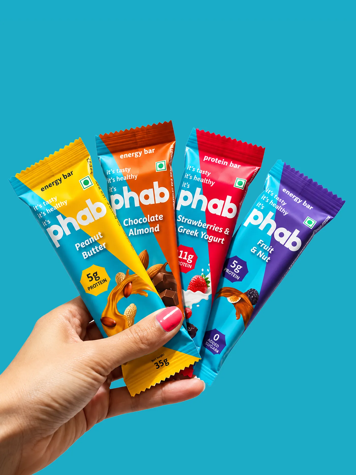
The Teal that broke the aisle.
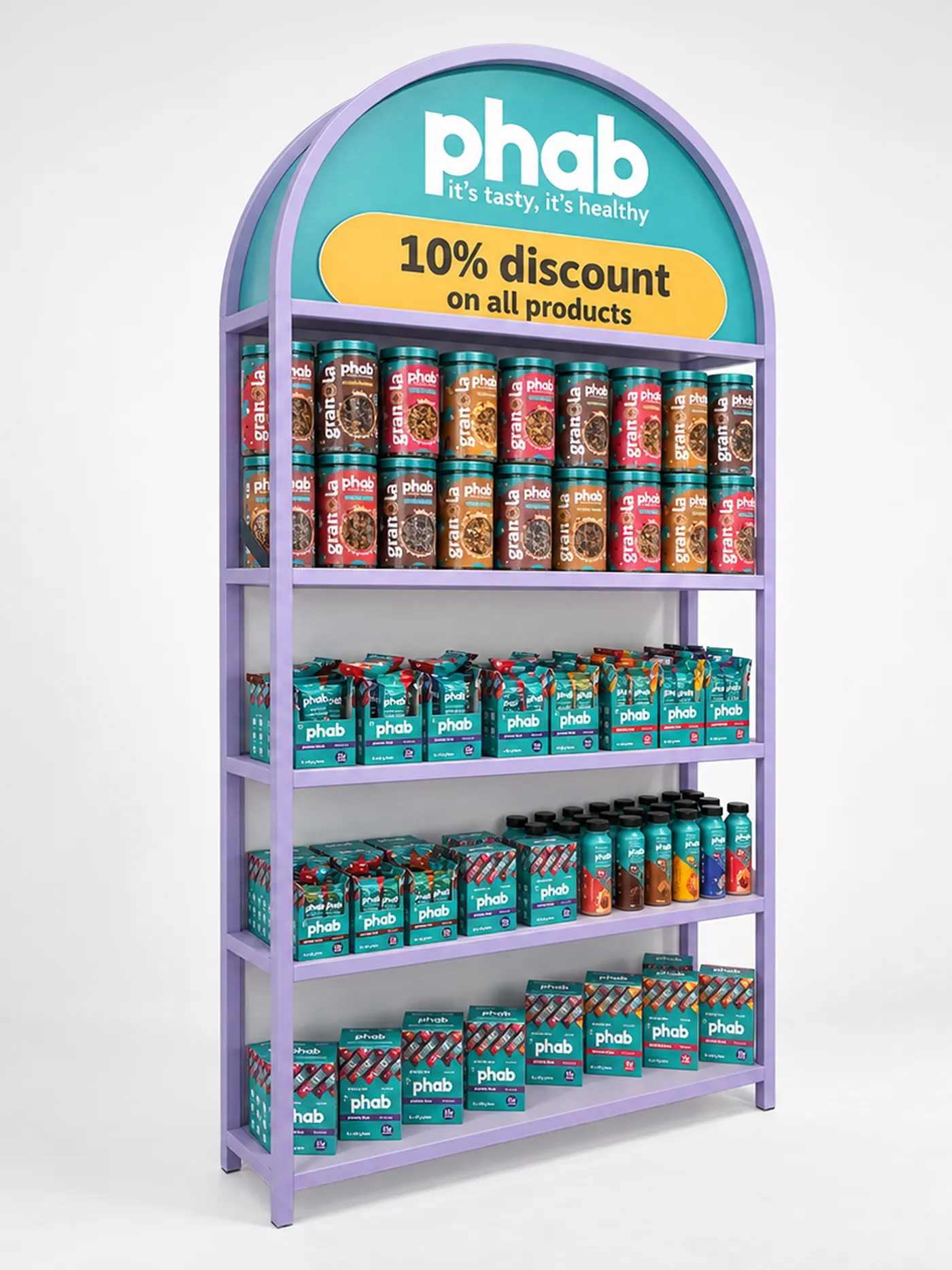
PHAB walked in with a genuinely good problem: a tasty, protein-first snack range across bombs, bars, and milkshakes, backed by real nutritionists and real science. What it didn't have yet was a presence loud enough to stand out in a crowded food aisle.
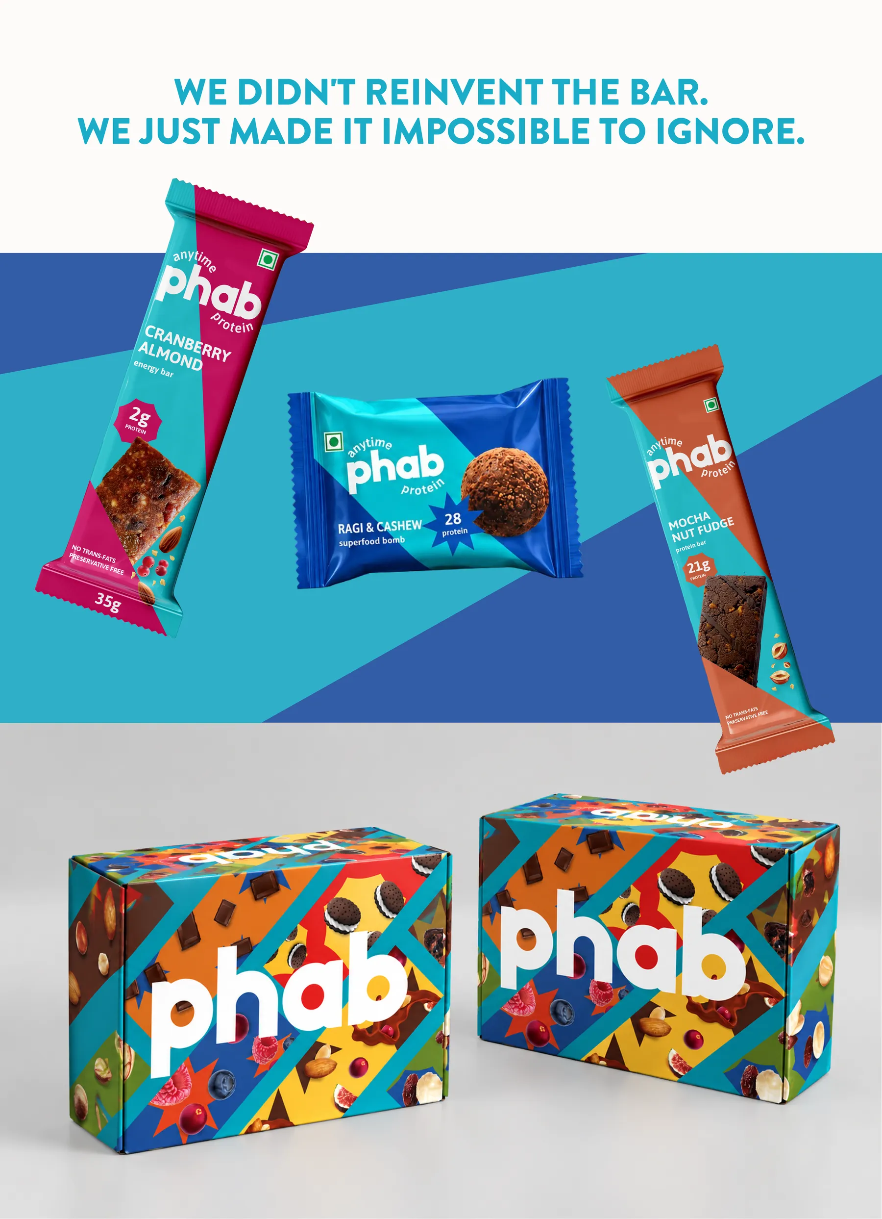
As part of our collaboration, we leaned into a friendly, witty, never elitist, approachable identity. We designed with the kirana store in mind first: in a 2x2 foot shelf crammed with a hundred competing wrappers, PHAB needed to be the one thing the eye catches without even trying.
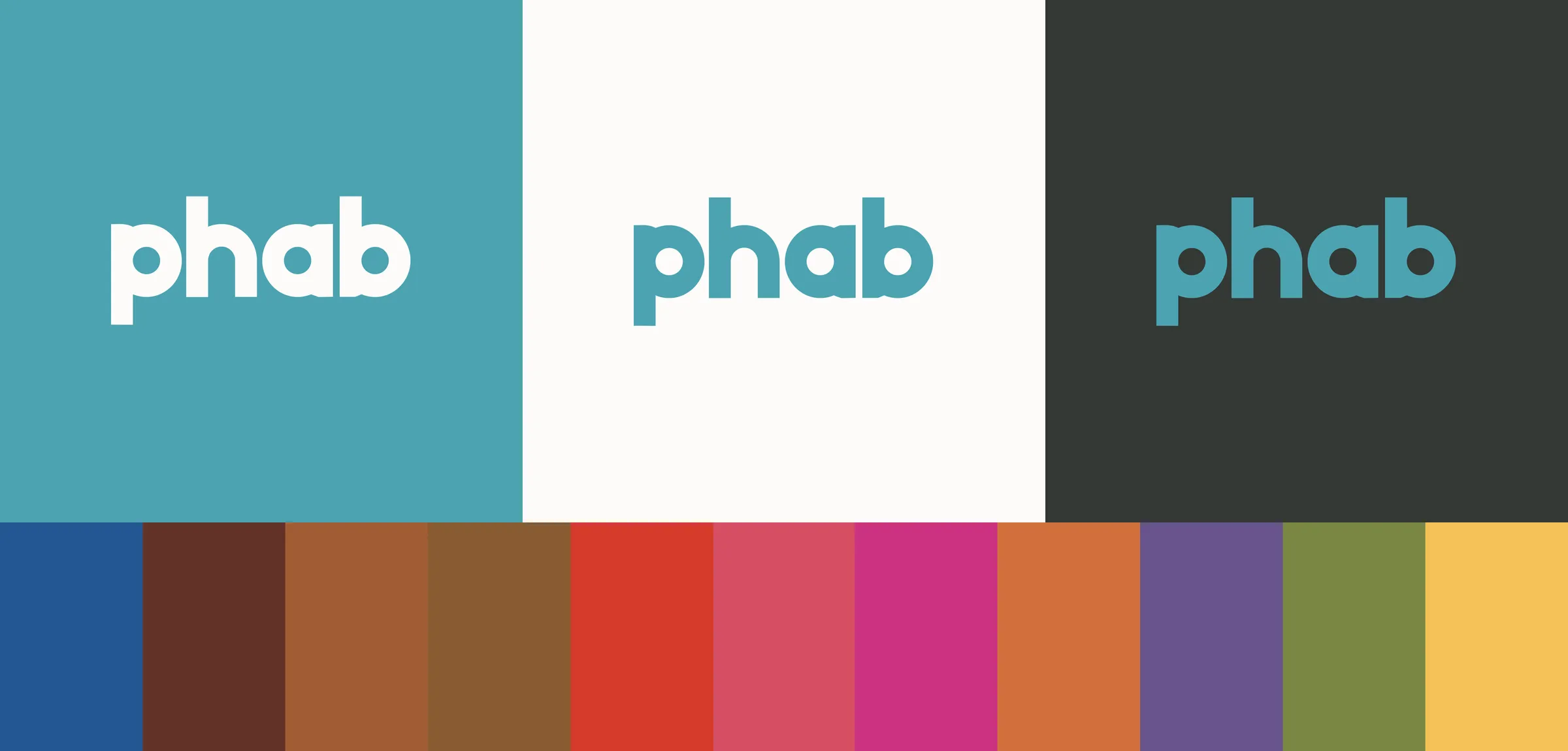
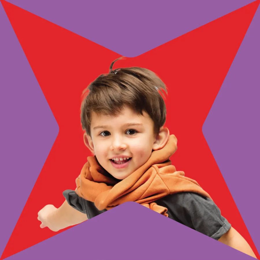
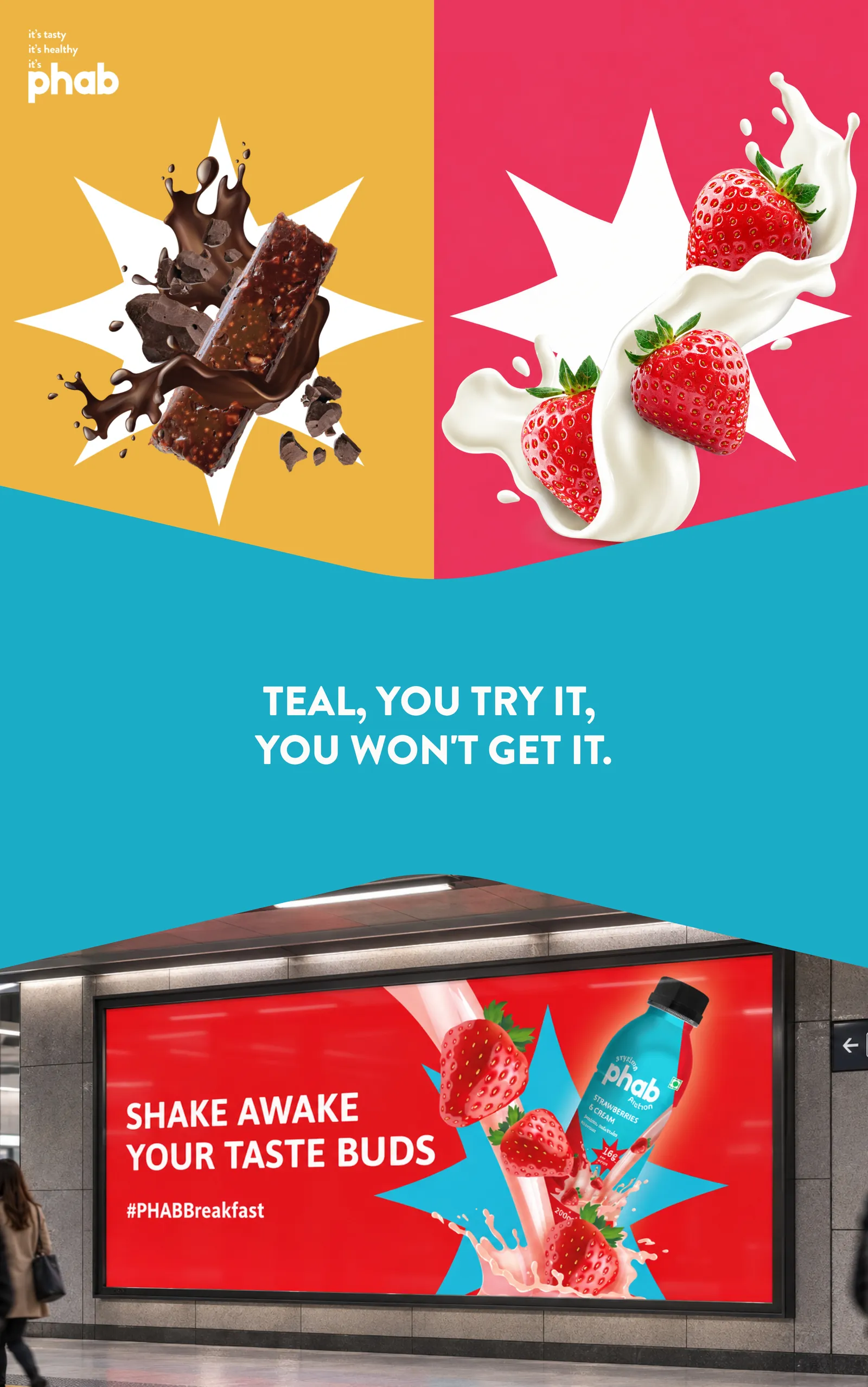
A bold wordmark, an ingredient visual language that was highlighted with a signature "spotlight" burst that turns every pack into a small explosion of energy. An eight-colour palette pulled straight from PHAB's own ingredients, and teal as the undisputed hero. It's become the shorthand people recognise before they even read the name.